Infographics

An infographic that was sent out to Circulate San Diego’s emailing list showing the organization’s stance on certain state propositions that concerned transit and housing. The color palette was chosen to fit a patriotic red, white, and blue theme, yet still be modern and energetic. The important “yes” or “no” stances are highlighted with the brightest colors. This was sent out in Circulate’s weekly e-newsletter; and posted on their website’s front page and blog leading up to the general election.
This voting infographic was done in Adobe Illustrator CC.


Safe Routes to School Infographic
A series of 9 infographics for the National City Elementary School District based on student pick-up and drop-off safety surveys conducted by Circulate San Diego’s staff. Using the results of those surveys, I visualized the data to show which safety features each school had, the number of students during drop-off and pick-up times, and how many vehicle violations were in the drop-off and pick-up zones. The gray boxes were left as placeholders for Circulate’s planners to write observations and safety suggestions to make drop-off and pick-up of students safer. These infographics were included in a more detailed and extensive report to the school district and individual schools.
This SRTS infographic was done in Adobe Illustrator CC.

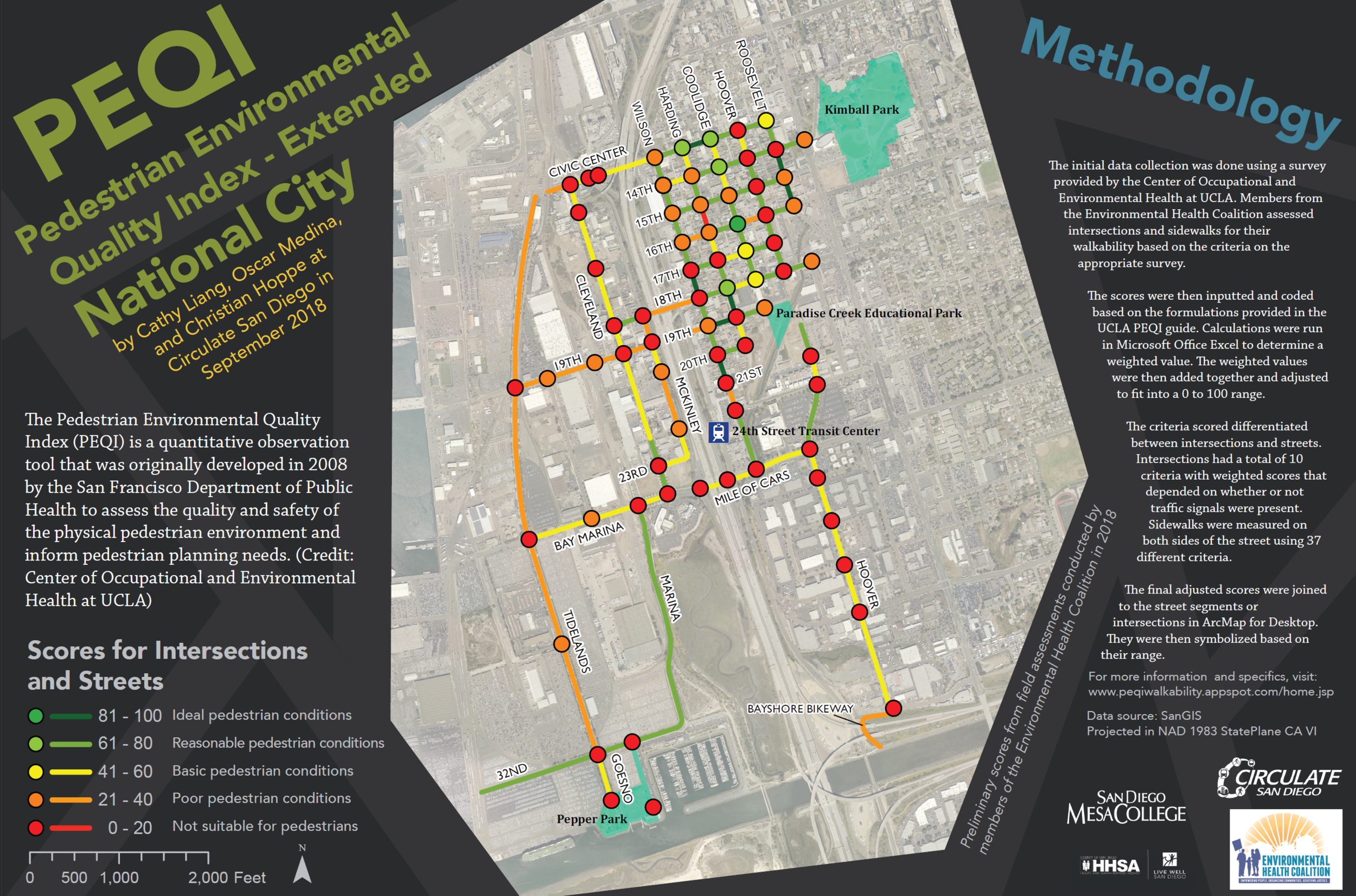
Pedestrian Environmental Quality Index Map
A map showing how pedestrian-friendly streets and intersections are in National City. These include factors such as street safety, how inviting a street is, pedestrian benches, landscaping plants, etc. I built upon a map Circulate’s client, the Environmental Health Organization, had commissioned the previous year. The Environmental Health Organization sent us survey sheets in which I calculated the scores based on the Pedestrian Environmental Health Quality Index formulas in Excel before transferring the data to ArcMap. This map was brought to community engagement events by Circulate San Diego staff.
I later rearranged the map into a scientific presentation for the ESRI User Conference 2019 map gallery as part of San Diego Mesa College’s ESRI Conference group.
The data calculations were done in Microsoft Excel. The results and map were done ArcMap Desktop and finished in Adobe Illustrator CC.