Mobility Certification Logo
Circulate San Diego’s Mobility Certification program provides recognition for transit-oriented, smart-growth development projects in the San Diego area.
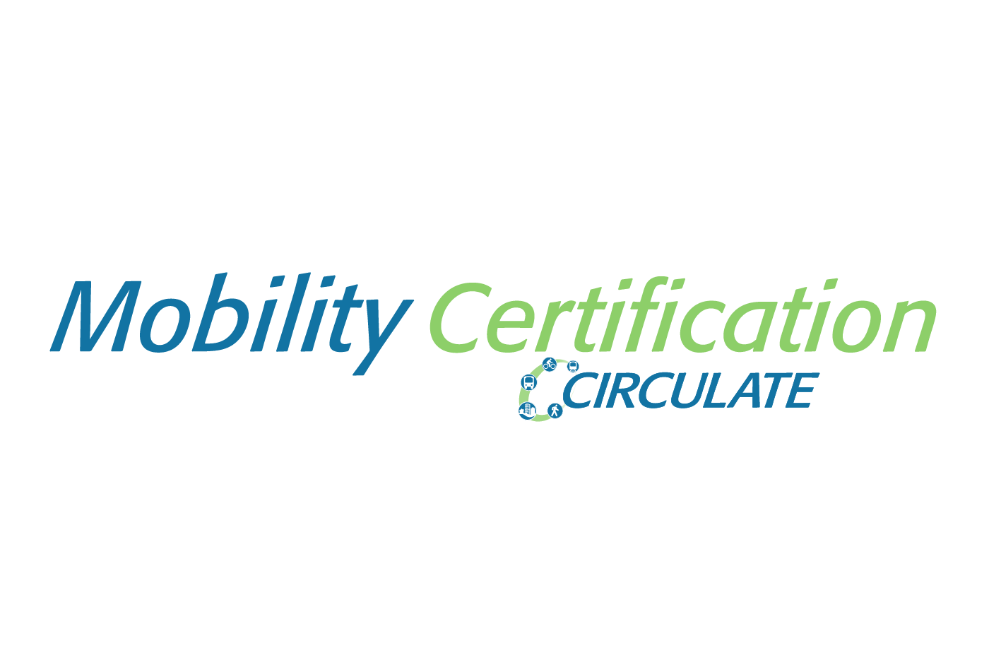
Circulate San Diego’s original logo. The Executive Director wanted a new logo just for their Mobility Certification program, but didn’t want to stray too far from the original. I created several variations on the text based on their original logo.
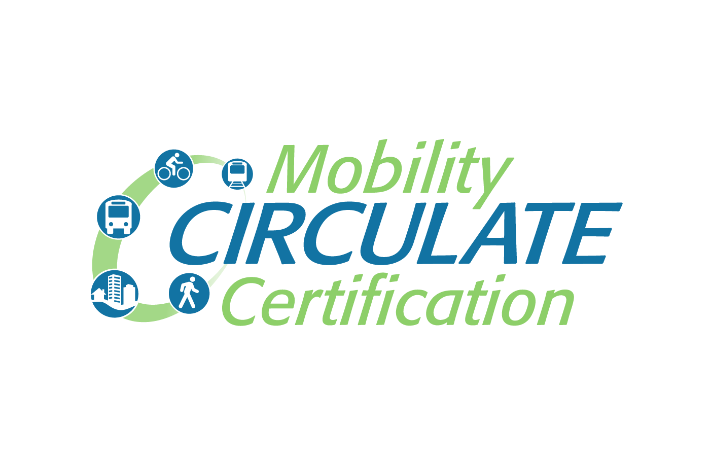
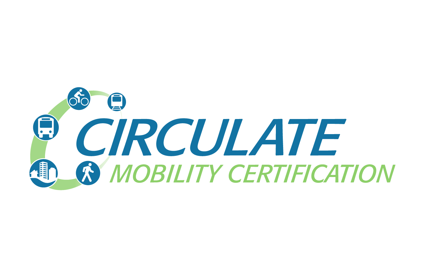

The Executive Director expressed to me later that the circle of icons was not easy to use when I mentioned the original logo was difficult to work with. The icons are small and in certain publications, they became indistinguishable.
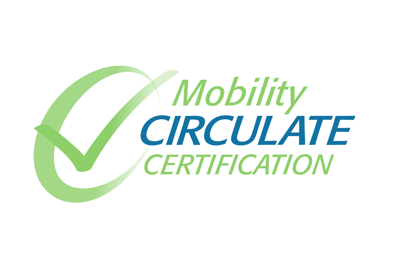
Having that knowledge, I tried a more simplified logo keeping the green circle and adding a checkmark.
The Executive Director ultimately made the decision to go with this checkmark logo after presenting to the Board of Directors with the majority vote. The one minor change was to take the gradient out of the checkmark.

The Executive Director also wanted something simple that certified projects can display on their webpages and other media. We decided on a digital version of a traditional seal or stamp of approval. I created 3 sample seals based on the chosen logo.
The Executive Director liked the 2nd design with its bold color, but ultimately thought it looked too similar to the beer labels that are prevalent in the area.

Final Application
The logo and seal were then used in their Mobility Certification webpage. Click the link below to check out the full webpage. After finishing the final images, I formatted them into their website.