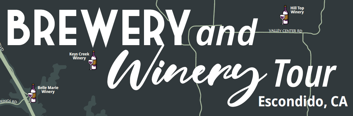
Points of Interest
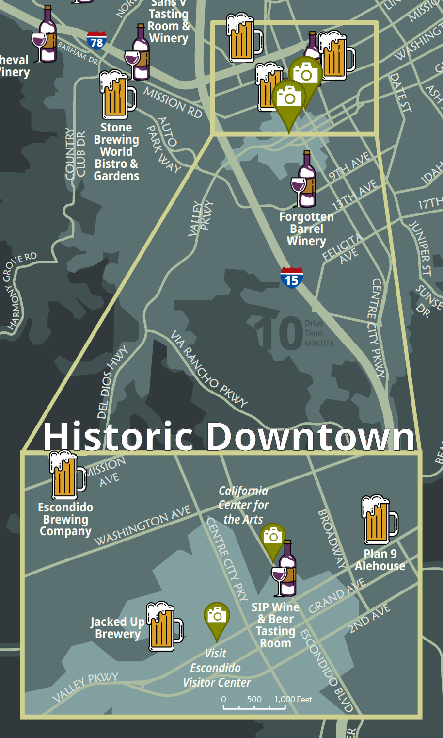
Inset Maps
The inset maps were used to zoom into areas where a number of locations were situated very close to each other.
An improvement would’ve been to make the border and guiding lines a different color or a lot bolder to stand out from the color of the roads.

Scale Bar
The GIS Analyst at the City pointed out that the scale bar should be in easily divisible numbers for the viewer rather than some odd number like 3.8 miles. Each tick mark should also be easily divisible on the scale bar, so rather than split a mile with 3 tick marks or 0.33 miles, I used just 1 tick mark to split into half mile intervals.
Icons
The wine and beer glass were custom made for the map. The wine glass incorporated the purple from the original color palette of Visit Escondido.
The Landmarks icon was a standard icon available in ArcGIS Pro recolored with the same green from Visit Escondido’s color palette. Going back, it would’ve been better to custom make a landmarks icon to match the other two icons.
Fonts
The title of the map was important to draw attention, so I picked some fonts that reminded me of breweries and wineries. The bold and rustic style reminded me of several microbreweries I had visited while winery was flowy and elegant like traditional wine labels.
The road names used the Visit Escondido font to incorporate their branding. However, their font was difficult to create hierarchy with, so we opted to use Noto Sans in order to have more options with place names and labels.

Cartography
We separated the highways from the major roads in the city using line weight. Due to the size of the map, we only included the major roads in the city to avoid clutter. We also marked the highways with the familiar interstate highway shield to give people a sense of location. We avoided making the roads blue since people might think they’re rivers or waterways.