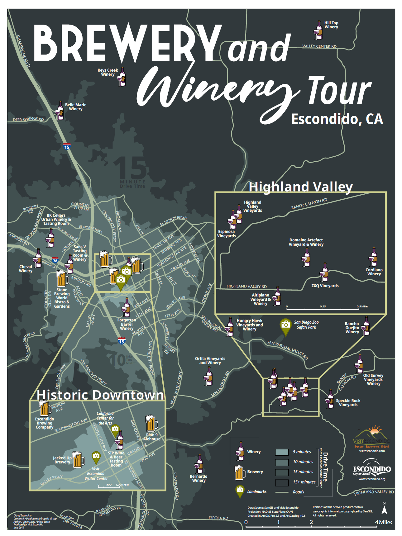
Escondido Brewery and Winery Tour Map
A map showing the locations of all the wineries and breweries in Escondido, CA with drive times. The print map was submitted to the ESRI User Conference map gallery in 2019.
Map was created by Cathy Liang with help from Diana Lecca in ArcGIS Pro and finished in Adobe Illustrator CC.

Starting the Project
This project began by talking City of Escondido’s GIS Manager with the intention of submitting a map to the ESRI User Conference. The manager helped us generate ideas and directed us to a potential department in need of an updated map. We then set up a meeting to pitch our idea, purpose, and services.

Gathering the materials
After meeting with the Visit Escondido tourism manager, we started gathering the materials needed for the map. From the tourism manager sent us the department’s colors, fonts, logos, and locations of all the wineries and breweries in the city. To set up the basemap, we used SanGIS, San Diego County’s publicly available GIS database.
We began with cleaning and setting up all the data we had gathered in ArcGIS Pro. This included placing all the wineries and breweries in their correct spatial locations using an address locator. We cropped all the GIS data to Escondido and the nearby vicinity. Finally, we created custom icons for the wineries and breweries using the Visit Escondido color palette.


Making the Mockups
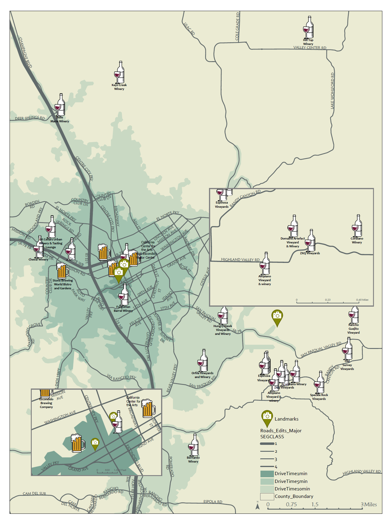
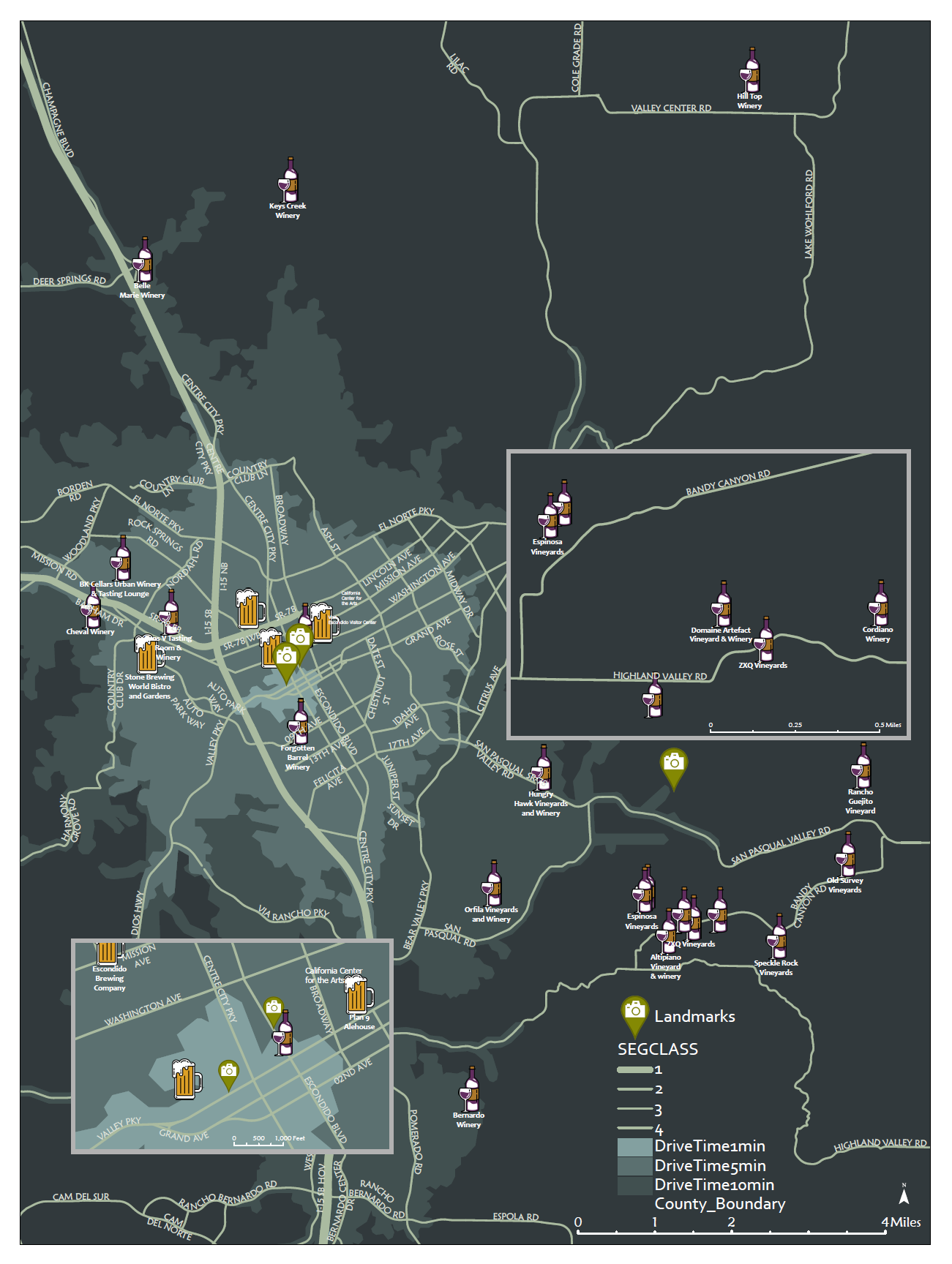
We created 2 mockups of the map with 2 different backgrounds based on the same gray-green hue. One with a dark background and one with a light background. The gray-green hue was chosen because it matched, but did not overpower the Visit Escondido color palette. The Visit Escondido color palette had a strong green, purple, red, and orange; and any other bright color would clash with them. We wanted a neutral background that wasn’t entirely black or white as the contrast would be a bit too harsh.
The drivetimes were calculated based on the road data from SanGIS with 5 minutes, 10 minutes, and 15 minutes. The Visit Escondido tourism manager had mentioned they would ask visitors who were interested in the city’s wineries and breweries how much time they had available for a visit and based recommendations off the visitors’ answer. The drivetimes also added depth to the map, giving it more variation for the eye to move around the map.

Technical Feedback
After some discussion with the graphics team, we decided on the dark background. We cleaned up the map, moving road names, fixing labels, and adding all the basic cartographic elements. This is when we approached the city’s GIS staff and asked for feedback on the technical elements. The feedback given was:
Fixing the scales for the main map and inset maps to easily divisible numbers. For example, the main map has a scale bar of 4 miles which can be easily divided. The Historic Downtown inset map has a scale of 1000ft which is a nice round number.
The icons don’t have to have pinpoint accuracy since they’re such odd shapes. The viewer won’t know if the actual location is based on the center of the icon, the top of the icon, the bottom of the icon, etc. We have to be accurate enough in that the icon is in the right area, but we don’t have be too fussy if it’s a millimeter off.

To the Conference
We used heavyweight satin paper to print the map. We didn’t want a high gloss just in case the lighting was too harsh at the conference, but we didn’t want matte because that would absorb more ink and make everything darker. Since our print would be ink heavy, we went with a heavyweight paper to put up with the printing without wrinkling. This map would also be hung on a wall, so it needed to hold its own weight.
Reflection
After the conference, we had time to reflect on what we could do better for our next map gallery. Some feedback I received from the GIS Manager after the conference:
“Where is Escondido?” - The GIS Manager overheard this question a lot at the conference. Next time, it would be best to include location map with an outline of California and a pin in Escondido.
QR Code - Time was an issue for this project since it was decided upon rather late, but next time, we should include a QR Code leading to the City’s website, the Visit Escondido website, or even an online webmap.
As for my own reflection, here are some considerations:
More time to plan ahead for a digital interactive map. We can easily export to the web from ArcGIS Pro, but it does require some adjustments from print-oriented to web-oriented design before it can be exported
Test for colorblindness and how easily the map can be viewed.
Bolder labeling. Make the major locations more distinctive and have more contrast for the inset maps.